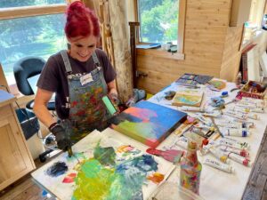
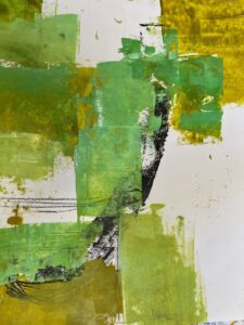
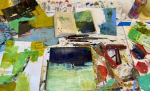
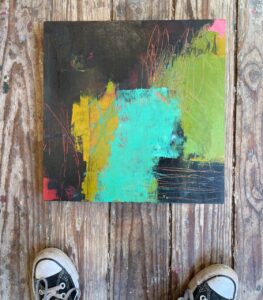
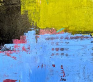
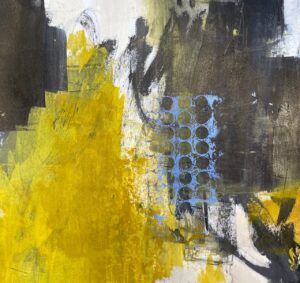
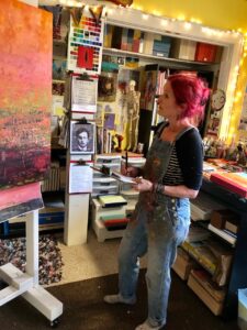
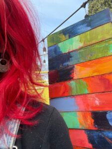
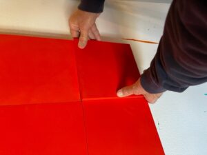
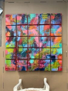
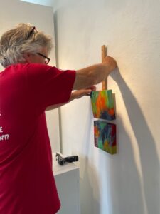
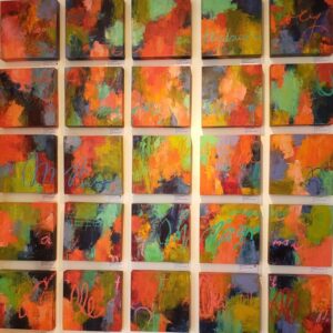
I had an idea for a painting I wanted in my show at Guardino Gallery. I envisioned a grid of smaller paintings hung together to create a large 40×40 inch piece of art. I decided the small paintings would be 8×8 inches. But the initial problem was how to hang 25 paintings in a manner that would allow me to work on all 25 at the same time, as if I was actually painting a 40×40-inch piece of art. My studio assistant came to the rescue. He devised a system using Velcro. He attached Velcro to the back of the 25 8×8-inch cradled panels, then matched up the other piece of Velcro to the wall, allowing all of the paintings to hang together, but could easily be removed for me to 1) paint the edges, and 2) work on each piece individually when it became time to resolve each piece as a single painting.
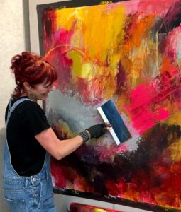
After I secured the 25 panels (thank you Art Department for ordering so many boards for me), they were primed with fluorescent pink and orange acrylic paint by my studio assistant. I decided to start the painting process using acrylic paint to get lots of layers of color and marks. It was such fun to paint across the surface with grand swaths of paint, and occasionally pull the panels off the wall to wrap paint around and onto the edges.
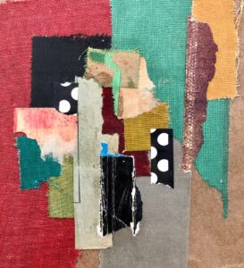
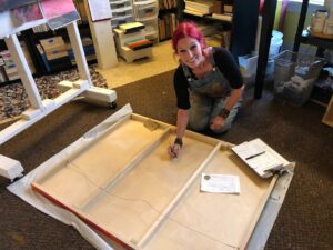
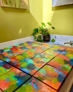
Priming the 25 boards.Howard measuring and attaching the Velcro.An ingenious system.Snapping the last panel into place.My grid of smaller panels is a reality!The backs are taped and Velcroed.Acrylic paints below the works in progress.A section of painted panels. Can you see where they are nestled close together?Art quotes were added across the surface of the 25 pieces.
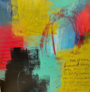
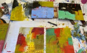
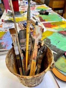
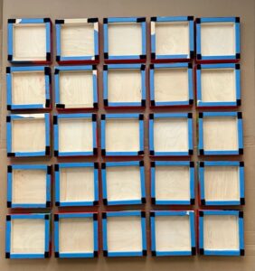
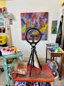
After a few layers of acrylic, I switched to oil paint mixed with cold wax, and began enhancing and adding more layers, words, and marks.
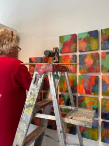
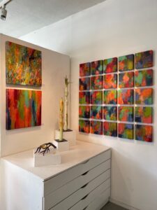
Refining each piece individually.Layers, layers, and more layers of oil and cold wax.Making progress. The view from standing on a chair.Documenting the progress.Drying across the bathtub on a warm, sunny day.A stack of completed paintings. I love the edges!
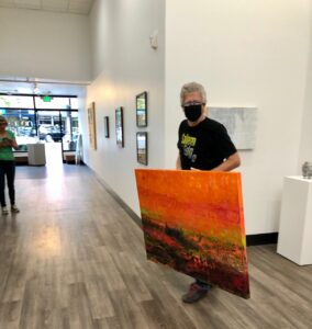
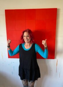
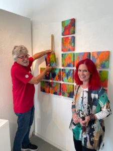
And today the grid was hung at the gallery!
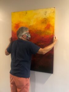
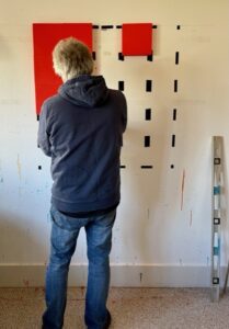
Getting started.I was Howard’s assistant for a change.One by one, Howard got all 25 pieces hung.My art next to three of Nadine Gay’s beautiful sculptures.It was sure wonderful to hang the show with three red dots!
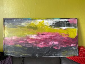
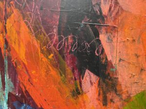
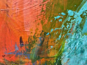
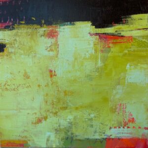
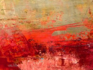
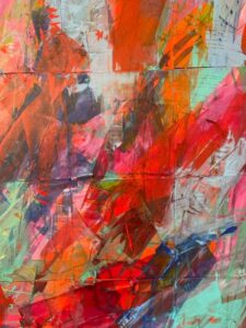
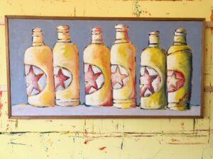
About ten years ago I discovered this 25×49 inch framed painting on canvas at a local Goodwill; I think I might have paid $25. I didn’t buy it for the painting, but as an inexpensive canvas to repurpose for my own art. The canvas got tucked away in our shed, and I forgot about it. Last year I rediscovered it and took a closer look. It was signed on the back by M. Runyan and it had been painted in 1985. I asked my artist friend Bonnie Hull, who is familiar with many artists in Salem over the years, if she knew of the artist, but the name didn’t ring a bell. So I decided I would give the painting a makeover. And as it turns out, another makeover, and then another until I was finally satisfied. For now, anyway.
I opened a big bucket of gesso and began covering erasing the six starred bottles (I kind of cringed and then cried a bit).
And then I began applying paint.
Life got busy and once again I abandoned this canvas. The bottles were gone, gesso applied, and some bands of color slapped on. Not sure where I stored the canvas, probably in the upstairs hallway, but it got tucked away until last July when I pulled it out again. This time I started adding swaths of black, green, pink, and burgundy.
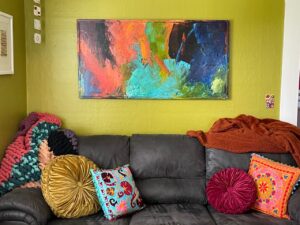
It was at a stopping point and I hid it away again for many months. Until two weeks ago when we packed it into our car and drove to Astoria. I thought maybe it would look nice in our House of Color since we were in need of a piece of art above our couch.
Nope. It didn’t look good at all and I didn’t even like the painting anymore, so instead of dragging it home, I took it upstairs to my studio and painted some swaths of wild color.
It was fine, kind of fun, definitely colorful, but it lacked any kind of KAPOW, so back upstairs it went. I pulled out more paint, began spreading, scraping, and marking.
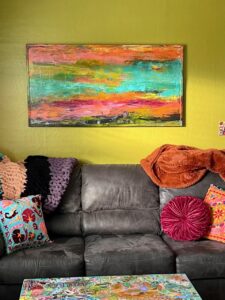
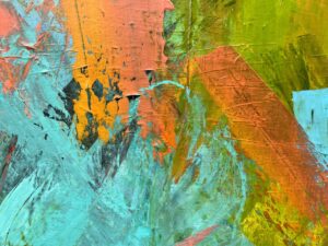
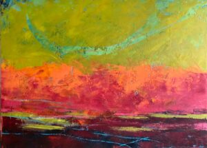
It was finally what I had wanted all along (but didn’t know what that was until it appeared). Here is the final painting and some close ups of different areas.
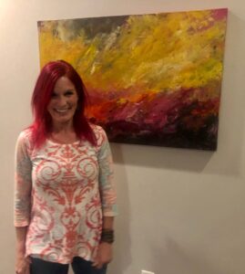
“A Courageous Act of Flamboyance,” 25-1/2 x 49-1/2 inches, acrylic on canvas, sealed with cold wax, and a painted frame, by Dayna Collins.
But guess what? I needed a big painting for Fogue Gallery in Seattle, so this finally finished pop of color piece of art will be heading north on Thursday and be on display and for sale just in time for the Georgetown Art Attack on Saturday, April 7.
And the wall above our couch is once again empty and in need of art.
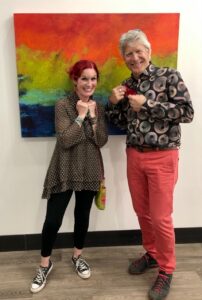
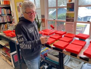
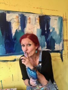
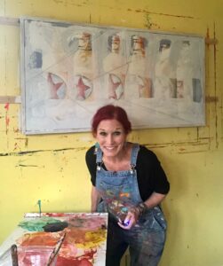
I am pleased to offer an article written by guest Howard Collins. Howard is my spouse of 49 years and for the past year, the business manager for my art practice. Howard is my number one fan and his taste in art has evolved through the years, which prompted him to write this article for my blog.
Howard is an active participant in Dayna’s art practice, doing everything from administrative to schlepping.
“Ugh.” “I don’t get it.” “That’s weird.” “What’s the point?”
These words have admittedly come from me about abstract art.
My gradual transformation into appreciating and loving abstract works has taken time. Unlike the acquired taste for kombucha, which took real effort and perseverance, coming to love abstract art was more evolutionary than effort.
Howard checking out Dayna’s January, 2021 show, “Emotional Alignments” at RiverSea Gallery in Astoria, Oregon.
My early years of art appreciation was not as a result of education. It was more akin to “Me like, pretty,” when I saw something that caught my eye. But art has always been important to me regardless of my ignorance. My eye was attracted to precision, to realism, to clarity, and realistic portraits. In walking through museums, I was attracted to and spent as much time as I could looking at the details by various master artists. I always gave a short glance at modern, contemporary, and abstract art, but never much time and clearly little thought.
However, I subtly found myself spending more time looking at impressionist art and less realistic works. Monet blew me away. Here was realism without precision and detail, but beautiful nonetheless. This was a style of art without precision, but collectively, the strokes created beautiful compositions. My eyes began to look at the art of other impressionists and marvel at their beauty. Without warning I began to spend even more time looking at non representational art. My world of art appreciation exploded.
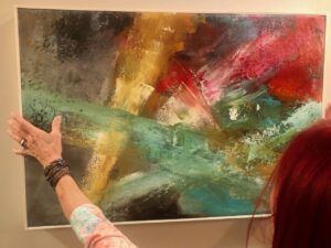
“Turns of the Kaleidoscope,” 30×40 inches, plaster, oil, and cold wax. One of Howard’s favorite pieces.
Dayna’s taste in art has always differed from mine. I began to look closer at pieces and artists to whom she was attracted. It stretched me to look at works that I previously would only glance at and rarely see. Vertical and horizontal colorful lines, unusual compositions, and figures in ways that had usually left me cold, now drew me in.
Howard spending time with six 12×12 pieces in Dayna’s “Turns of the Kaleidoscope” show at Salem on the Edge, May, 2021.
Modern art, cubism, angles, distorted figures all called me to view them in a way I had not felt before. I found Pollock, Kandinski and de Kooning, and a renewed interest in Picasso.
And therein lies the difference for me. I felt the art. An emotional response rather than mere appreciation of the art. Feeling what the piece was sharing with me, allowing the piece to talk to me. This was a moving experience and was totally unlike viewing realistic works. As strange as it sounds, listening as a piece talks to you is quite normal. Explaining how this works for me is difficult, but it is real. For me works of art talk to me through their composition, arrangement, color and form, which cause an emotional response in me.
My eye views abstract art and its perceived disorganization in different ways. At times I seek to make sense of the abstract lines, shadows and colors by seeing what I can see. At times I take in the whole of the abstract and free myself from my realism tendency; and then at other times, I pick a small portion to see what I can see and hear from the art. If I bring an attitude of openness, it allows the painting to express itself and for my eyes, brain, and emotions to react.
One of Howard’s favorites: “It Smelled Like the End of Summer,” 30×40 inches, plaster, oil, and cold wax, now hanging at The Independence Hotel.
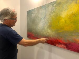
I have to interject a side story here. We recently talked to the maintenance engineer at The Dundee Hotel. I told him Dayna was the artist of many of the works hanging there and his eyes lit up. “Did you do the pieces in the conference room?” he asked Dayna. “Yes,” was her reply and he said: “I have questions for you. I’ve studied them.” We walked to the three painting and he wanted to know if the images he saw in them were intentional. He saw birds, a cow, and other animals throughout her works. Dayna laughed and said “Don’t show me, I’ll never be able to not see them.”
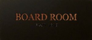
Jim points out what he sees in three of Dayna’s abstract paintings, now hanging in the Board Room of the Dundee Hotel.
He was astounded to hear that Dayna had not intentionally included farm animals in her abstracts. He was trying to make sense of the abstract work though his interpretation of what he saw. By the way, he loved the works and his appreciation came from their composition and his interpretation, and not by the intention of the artist.
In my wasted youth, I thought Picasso was odd, irrelevant, and not really worth looking at. Even today not all of his pieces move me, but many do in a way I would never have thought possible. His humor is outstanding. I stood before a Picasso series created during the last months of WWII and I was laughing. They were optimistic, playful, joyful and irreverent. Yes, I was the only one laughing, but that’s me. They were simply magnificent.
Then there is the power of abstract. There is power in the stroke, texture, form, composition, and message. With or without a representational image, abstract work speaks and conveys a message. In part, the power comes from eliminating a common scene or picture for our minds to see. We are engaged to interact with the artists’ work. Just as letting our children play in a dusty pile of dirt, they create games, form roads, and valleys in their minds, which they translate into the dirt pile; just as we get to create from abstract art.
One of Howard’s favorites: “Fleeting Amazement,” 24×36 inches, acrylic on canvas, hanging at The Dundee Hotel.
Amazingly, the power of abstract art endures beyond a single viewing but continues over time and changes as we see different elements as we change. A piece of Dayna’s work, Singed by Fire and Light, hung in my office for three years until I moved my office home. Every day this piece spoke to me, every day it gave me something. Sometimes it spoke to me as a whole, drawing me deep inside; sometimes from a small section, sometimes from hints of color revealed from the sunlight pouring in the window. I miss this piece terribly. It now hangs beautifully at The Dundee Hotel, where I am writing this piece and I’ve literally hugged it.
Howard hugs “Singed by Fire and Light,” now hanging in The Dundee Hotel.
I still appreciate and enjoy realism and impressionism. But abstract art, with a big thank you to my wife, attracts me, speaks to me and fills me.
Artists Dayna admires:
Joan Mitchell, Helen Frankenthaler, Lee Krasner, Elaine deKooning, Cy Twombly, Robert Motherwell, Robert Diebenkorn
One of Dayna’s favorite artists: Helen Frankenthaler
Artists I admire:
Mark Rothko, Willem deKooning , Jackson Pollock, Picasso, Kandinski, Dayna Collins
Dayna and Howard at the opening of Dayna’s show at Salem on the Edge in May, 2021, “Turns of the Kaleidoscope.”
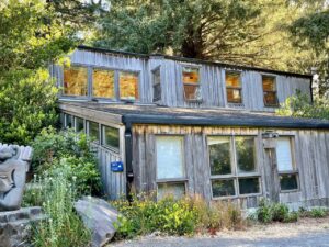
Last week I was finally back at Sitka in the beautiful Boyden studio, not teaching, but taking a class from Eugene artist Zoe Cohen. The class was titled Abstract Investigations: Color and Composition. What a great class in my one of my favorite locations — on the Oregon coast at Cascade Head.
Zoe’s description of the class:
This four-day workshop is designed specifically for abstract painters to help clarify visual language and bring intentionality to their painting practice. We will make a deep inquiry into what inspires our art through examining contemporary abstract art, informal writing exercises and instructor demos. We will traverse the full range of the spectrum from intuition to deliberate action, from right brain to left brain and from spontaneity to decision, and we will learn to travel back and forth between these polarities.
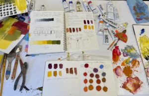
The class had all the elements that are important and that I love. The first day we focused on value and color mixing, always a good place to start.
The second day we focused on tools and techniques, and we were all off to the races after a couple of demos by Zoe. The day for me was dedicated to initial layers and playing around with leftover paint.
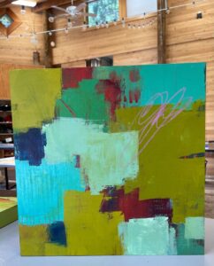
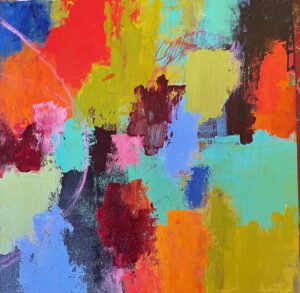
Day 3 was more layers and exploration of abstraction, intuitive versus deliberate actions. We began to look for the composition in our paintings and move our pieces forward. I worked on 10×10-inch pieces of Stonehenge printmaking paper, 12×12-inch wood panels, and 14×14-inch cradled birch panels. I liked jumping between these three substrates.
On the final day, we primarily focused on painting and completing a few pieces. It was a whirlwind of a day, especially since we had to stop a little early to pack up and have a show and tell before class concluded.
These are the pieces that I moved forward to various stages of completion; a few of them I have declared finished and the others, I’ve just stopped at interesting places.
Post script . . . . .
Each morning before heading to class, I read a section from jung pueblo’s Clarity and Connection.When I read something that resonated with me, I jotted the words down in my visual journal–the journal I took to class and where I took notes. On our final day, this was the passage I wrote in my journal:
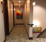
Last month, I wrote about my art being in a boutique hotel, along the bank of the Willamette River, The Independence, and just a 15 minute drive from Salem. When I wrote that blog post, I had three pieces of art on display at the hotel. As of writing this post, I now have an additional ten pieces there, and I haven’t even seen them yet! We plan to pay another visit (and another overnight) later this summer after their restaurant reopens in July.
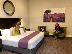
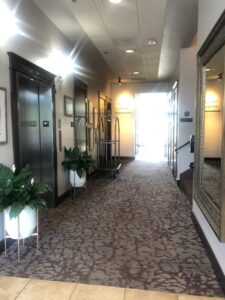
I am writing now about another hotel in the Trace Hotel family, where I also have art, The Dundee. This hotel is located in Dundee, Oregon, in the heart of Oregon’s famous Willamette Valley wine country, and about a 40 minute drive from Salem. My art was installed the end of 2019, and then 2020 arrived, bringing Covid with it, and everything shut down. As things reopened in 2021, we decided to visit The Dundee. We were invited to come stay at the hotel, so earlier this month we went to The Dundee for three nights. Oh my. The Dundee has a stylish vibe and touches of luxury. Photos tell it best.
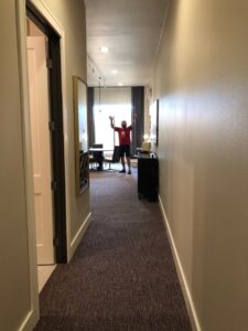
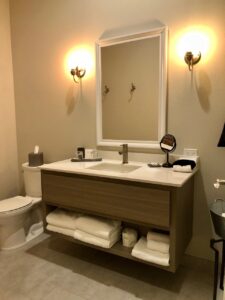
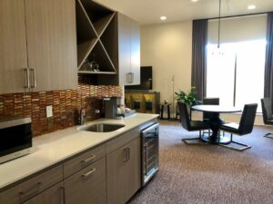
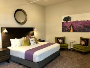
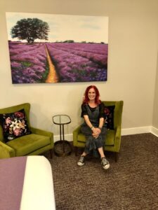
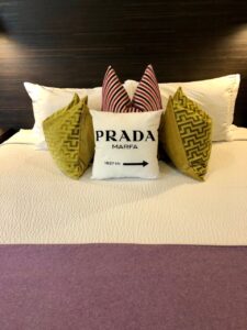
When we walked into our suite, Howard disappeared down a long hallway……Luxurious bathroom.A kitchenette with a full refrigerator.Okay, that’s a BIG bed.My green! In chairs!Marfa is more than a day trip.
Once we were settled in, we started exploring, looking for my nine pieces of art; it was a bit like a scavenger hunt. Three of the paintings were right outside the door of our room on the second floor of the first building.
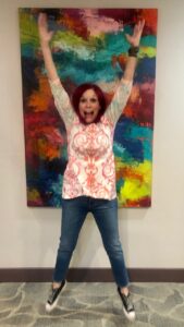
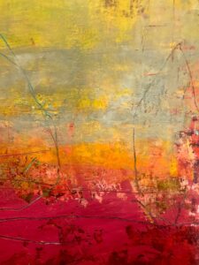
This painting, “Singed by Fire and Light,” hung in Howard’s office for several years. He has missed it, and was thrilled to discover it was hanging right outside our room.Jumping for joy in front of “An Unaccountable Exhilaration,” 44×66 inches, plaster, oil, and cold wax, by Dayna Collins.“Fleeting Amazement,” 24×36 inches, acrylic on canvas, by Dayna Collins.
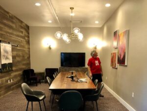
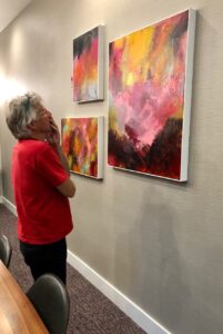
We continued our search. Right around the corner from our room, was the conference room, or Boardroom, and inside were three of my acrylic pieces.
Howard ponders this grouping of three acrylic paintings in the Boardroom at The Dundee.
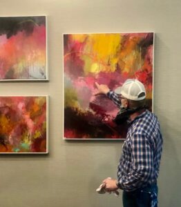
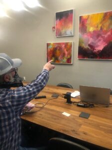
When we were in the hallway, Jim, the hotel’s maintenance person, found out I had painted several of the paintings in the hotel and asked if I had by chance painted the pieces in the Boardroom. When I replied that I had, he said, “Come with me. I’ve studied those paintings, and I have questions for you.” In we went.
Jim offers insight about what he sees in these three paintings at The Dundee Hotel in the Boardroom.Jim points out the “animals” he sees in these paintings.
Jim’s question was if I had intentionally placed animals in my paintings. I told him I hadn’t, but he insisted he saw a bee, a bird, a cat, and a COW!
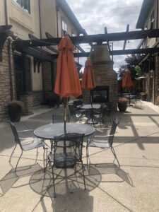
We set out again on our mission to find my paintings, leaving the first building, passing a great courtyard between the two buildings, and then entering the second building.
Courtyard of The Dundee Hotel.Building Two of The Dundee Hotel.
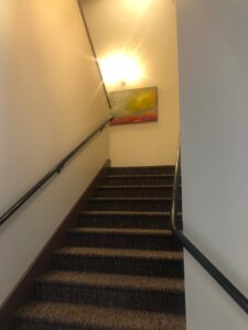
We spied the first painting on the landing between the first and second floors.
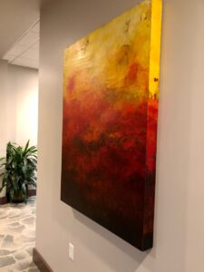
“Morning Clouds Giving Way to Sunshine,” is in the stairwell between the first and second floor at the Dundee Hotel.Howard enjoys analyzing what he sees in a painting. This one, “Morning Clouds Giving Way to Sunshine,” 30×60 inches, plaster, oil and cold wax, by Dayna Collins, is in the private collection of The Dundee Hotel.Detail of “Morning Clouds Giving Way to Sunshine,” plaster, oil, and cold wax, by Dayna Collins.Detail of “Morning Clouds Giving Way to Sunshine,” plaster, oil, and cold wax, by Dayna Collins.“The Emporium of Small Delights,” 36×48 inches, plaster, oil, and cold wax, is located at the end of a hallway on the second floor.Visiting “A Stirring of Possibility,” 22×32 inches, framed acrylic on canvas.
We had a beautiful three nights in the heart of the Willamette Valley (surrounded by wineries if you are a lover of wine) and we are already looking forward to our next visit.
Bonus: Painting what would eventually become “Without Thought or Emotion,” in 2019, and is now hanging in The Boardroom at The Dundee.
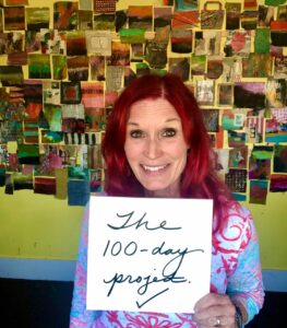
So what happened to those 100+pieces of art I created from January 31 through mid May? The ones I blogged about on March 21st at the half way point and the ones I celebrated on May 12th when I completed the project?
I turned some of them into cards so I can write thank you notes to people who purchase paintings.
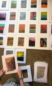
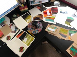
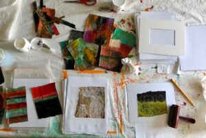
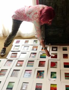
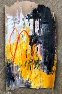
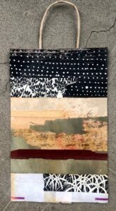
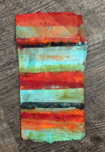
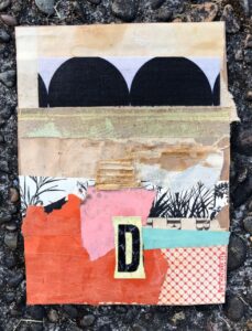
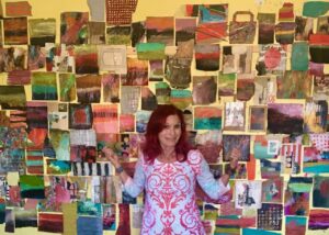
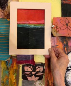
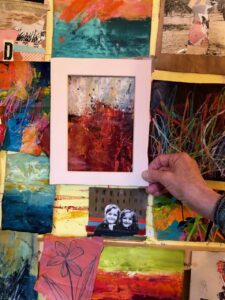
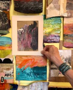
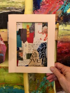
But I had the most fun matting 44 of the paintings and collages I created. If you aren’t familiar with the project, artists were challenged to create a piece of art or do something creative for 100 days (my entire process was documented on Instagram at DaynaLovesArt). We were encouraged to investigate a particular medium, theme, or idea. My chosen project was to create art on scraps of the lowly brown paper bag. So, I ripped apart lots of paper bags that I had stashed away, and for 100 days I painted using acrylics or oil and cold wax, or I collaged using scraps of paper, or I combined a bit of paint and collage. I ended up with over 100 pieces of abstract art. I chose 44 of them to seal with varnish, then glued those pieces to a backer board, adhered a 45-degree beveled edge mat to frame the art, wrote the day I created the piece, signed my name, and put each piece in a clear bag. Whew. I’m tired just writing the various steps.
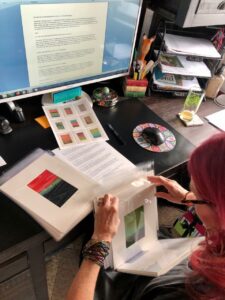
Then the more behind the scenes work began. After the pieces were ready, I wrote a description of how I created each piece, took photos, and turned the photos and text over to my IT/business manager/website guruspecialistwilling partner for posting in my Shop: 100 DayProject. But here’s the thing/the small print/the catch. I have been trying to grow my email list so I am shamelessly soliciting sign ups by announcing when this special shop will open to subscribers ahead of when I announce it more publicly. My June newsletter is about ready to launch, so I thought I would make a final push and give my friends, art lovers, curious followers, and even my family, the opportunity to sign up for my newsletter. The newsletter will share two things in particular about this project: 1) when the shop will open for purchasing these pieces, and 2) why I am pricing these pieces at $49 (which includes shipping). You might be thinking, “Another newsletter?!?” Yawn. I promise that my newsletters aren’t too long, I include content that isn’t shared on other social medium platforms (or at least different photos), and I won’t bombard you with lots of emails. If I have your interest at all, just click on the link, which will take you to my website where you can sign up. NEWSLETTER LINK
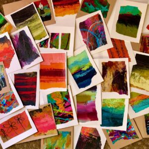
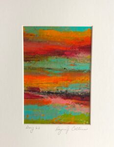
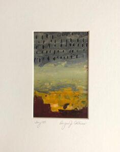
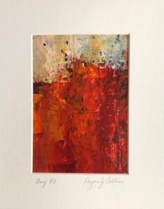
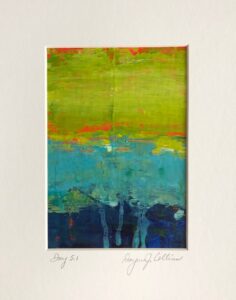
About now you are probably thinking, or at least I would be, enough with the words, show us some art. Here are some of the pieces that will be available for sale for $49.
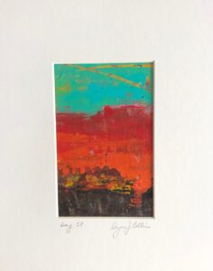
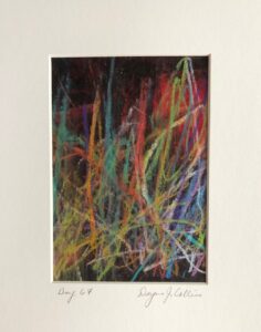
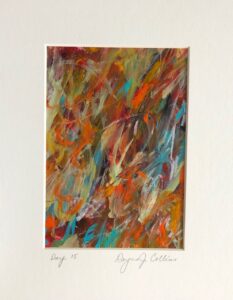
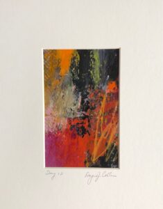
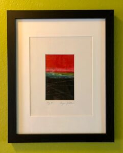
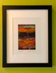
Day 58 Oil and cold wax on brown paper bag, by Dayna CollinsDay 67 Acrylic and wax crayon on brown paper bag, by Dayna CollinsDay 62 Acrylic on brown paper bag, by Dayna CollinsDay 49 Acrylic and Stabilo pencil on brown paper bag, by Dayna CollinsDay 75 Acrylic and collage on brown paper bag, by Dayna CollinsDay 5.1 Acrylic on brown paper bag, by Dayna CollinsDay 15 Acrylic on brown paper bag, by Dayna CollinsDay 12 Acrylic and wax crayon on brown paper bag, by Dayna Collins
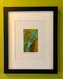
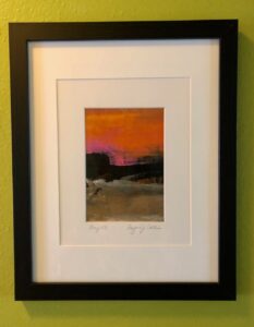
Each of these pieces is matted to fit an 8×10 (or larger) frame. In case you can’t envision what that would look like, I put different pieces in an 11×14 frame (with an 8×10 cutout), so you can see the power of a frame.
Day 32 Acrylic and wax crayon on brown paper bag, by Dayna Collins (frame not included)Day 29 Acrylic on brown paper bag, by Dayna Collins (frame not included)Day 48 Oil and cold wax on brown paper bag, by Dayna Collins (frame not included)Day 28 Acrylic on brown paper bag, by Dayna Collins (frame not included)
This was a frame I got very inexpensively at Michael’s, so you can either use a nice frame or an inexpensive one. If you want a smaller profile, these mats will also fit nicely in a simple 8×10 frame.
Thank you for reading my blog. I appreciate each of you who support me and my art journey.
It is hard to believe that 100 days ago I embarked on a project where I committed to make a piece of art every day for 100 days. That’s a lot of days and a lot of art. I wrote about the project on Day 50, so if you want more info just click on the link.
Very first piece for #the100dayproject: acrylic painting on a scrap of brown paper bag.
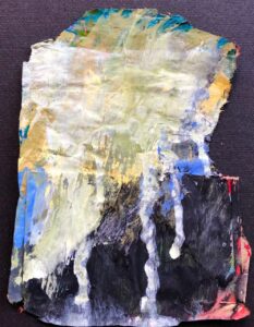
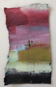
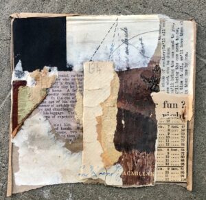
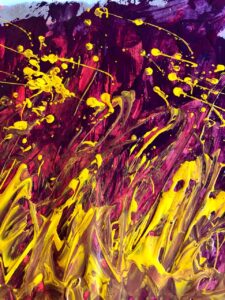
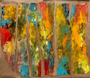
In a nutshell, over the past 100 days I created art using scraps of brown paper bags. The mediums I used included oil and cold wax, acrylic paint, and collage. Some of the materials I used in the pieces: black and white photographs, Stabilo Woody Crayons, pencils, vintage ephemera, book scraps, paper frames, and charcoal. Techniques and designs included splatter painting, drawing, stripes, circles, stencils, scraping, tearing, gluing, squeegees, and mark-making.
Last piece for #the100dayproject: Acrylic painting on a scrap of a brown paper bag, with strips from discarded books, and a B&W photo found at a flea market.
What I learned during the past 100 days:
True art is in the doing and there is no shortcut for that.
I like to work fast to keep the inner critic quiet.
It was freeing to work on such an unimportant substrate as a brown paper bag.
I kept pushing myself to be bolder and to make more startling moves on my daily pieces.
It was amazing to create so many pieces, and although each piece was different, they created a unified body of work.
Some days it was this project that propelled me to go into my studio. Sometimes I stayed.
Several new ideas emerged from this project and I am letting them percolate for future projects.
A very exciting byproduct was how two of the paper pieces I created inspired bigger paintings!
Here is a random assortment of pieces from the second half of the project:
Right now I am celebrating the completion of the project . . . .
. . . . but I have some ideas brewing for moving forward with these pieces.
I have this wacky idea of offering some of these completed pieces for sale and giving first notice to those who are on my mailing list. Haven’t signed up yet? Want to? Here’s a LINK.
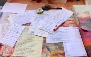
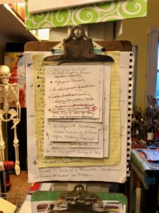
I am often asked how I come up with the titles for my paintings, so I’m going to spill the beans. Whenever I’m reading a beautifully written novel, I keep a piece of paper and a pen handy to jot down portions of sentences or phrases that resonate with how the words are put together. I do the same when I am reading poetry, just taking a few of the words, or “word fragments,” and scribbling them on a scrap of paper. I keep all of my pieces of paper gathered together on a clipboard, which I then refer to when it is time to name a painting. And I get to use one of my vintage clipboards!
It is a bit of a wonky system, and takes some maneuvering, but it has worked for me for many years and I enjoy the process of looking through my scribbles and putting together new combinations of words from the word fragments on my scraps of paper.
I have painted hundreds of paintings over the years, but here is a sampling of my work and the titles I have chosen.
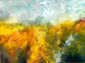
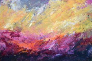
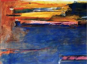
“A Narrow Illumination,” plaster, oil, and cold wax on cradled birch panel, by Dayna J. Collins“According to Sylvia Plath, the tulips are subtle, they seem to float,” plaster, oil, and cold wax on cradled birch panel, by Dayna J. Collins“A Protective Charm,” acrylic on 300 lb. watercolor paper, by Dayna J. Collins“A Ghostly Process of Waves,” oil and cold wax on cradled birch panel, by Dayna J. Collins“Small Bursts of Illumination,” acrylic on wood panel, mounted in floating frame, by Dayna J. Collins“Fallen Sun,” oil and cold wax on cradled birch panel, by Dayna J. Collins
Sometime back in 2012 (maybe before), I received a gift from my good friend Sam Hart, one of the most creative people I know and the superstar behind (the now defunct) Lil’ Gypsy vintage shop. On occasion, Sam left me gifts at my doorstep (she still does!) and back in 2012, when I had my studio in a small house on an alley in NE Salem, Sam gifted me this mannequin. She had a few battle scars (the mannequin, not Sam), so I wrapped her in a boa and gave her a pep talk.
Circa 2012
When I later moved my studio home, she hung out with me for a while upstairs . . . .
. . . and then she got banished to the basement.
I often thought about how I wanted to give her a new life. For a brief moment I thought about adding collage to her entire self, but it never seemed quite right. Then one day a few months ago, I decided to repair some of her more severe scarring. I put on my plastic surgery scrubs, and with a bit of duct tape and plaster, I repaired the worst of her owies.
After a light dermabrasion sanding, I gave her a clean slate: gesso, the great eraser.
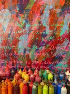
She was hanging out in my studio as I was transferring acrylic paint into squeeze bottles, so as I was doing this, I started using leftover paint on her body (I really should name her).
Layer by layer, patch by patch, swath by swath, drip by drip, my lady was transformed.
She was taken to the basement and given a coat of semi-gloss varnish to protect and seal her, then I did some drip painting on the base. And today is her debut!
Now I just need to figure out where she will live.
Awhile back I purchased a large reddish metal star at a closeout sale with the intention of painting it and hanging it at our beach house in Astoria. I didn’t know what color I would paint it, but then inspiration struck. I would use ALL the colors. I had done splatter painting a year ago, when I embellished a concrete statue, and I liked how it turned out.
So I got out a tarp, all of my cheap craft paints, a water spray bottle, and put on my paint clothes. I put the star in the middle of the tarp . . . .
. . . and got started with flinging paint.
Somewhere early in the process, I remembered we had two chairs that we had spray painted last summer, but were in need of sprucing up, so I dragged out another tarp and got the two chairs out of storage. That’s when it really got fun (and very messy).
I spent the afternoon flinging paint, using up the little bottles of craft paint. Even our cat Sinatra was interested by the end of the afternoon.
Post Script: I had so much fun that afternoon, that I went upstairs and pulled out a partial painting of acrylic on a cradled wood panel and put it on the floor in my studio. Using my Nova paints in squirt bottles, and with more intention that my wild painting outside, I kind of carefully flung paint onto the painting.
When it was thoroughly dry, I took the painting to the basement and applied a layer of water-based varnish.
I must admit, I kind of love it a lot.
“A Sense of Pandemonium” 31x24x1-1/2″ Dayna J. Collins
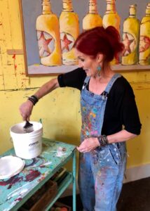
 And then I began applying paint.