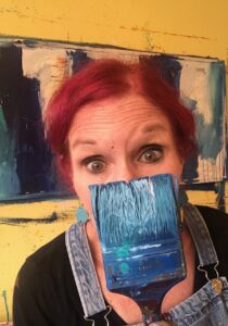
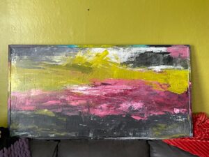
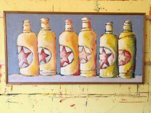
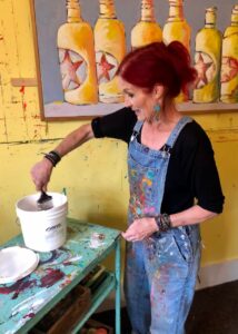
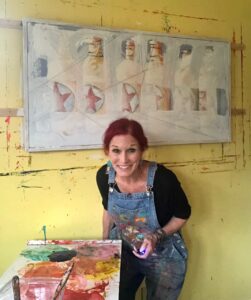
About ten years ago I discovered this 25×49 inch framed painting on canvas at a local Goodwill; I think I might have paid $25. I didn’t buy it for the painting, but as an inexpensive canvas to repurpose for my own art. The canvas got tucked away in our shed, and I forgot about it. Last year I rediscovered it and took a closer look. It was signed on the back by M. Runyan and it had been painted in 1985. I asked my artist friend Bonnie Hull, who is familiar with many artists in Salem over the years, if she knew of the artist, but the name didn’t ring a bell. So I decided I would give the painting a makeover. And as it turns out, another makeover, and then another until I was finally satisfied. For now, anyway.
I opened a big bucket of gesso and began covering erasing the six starred bottles (I kind of cringed and then cried a bit).
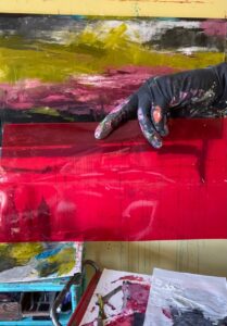
And then I began applying paint.
Life got busy and once again I abandoned this canvas. The bottles were gone, gesso applied, and some bands of color slapped on. Not sure where I stored the canvas, probably in the upstairs hallway, but it got tucked away until last July when I pulled it out again. This time I started adding swaths of black, green, pink, and burgundy.
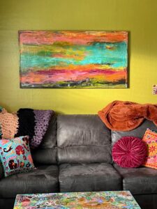
It was at a stopping point and I hid it away again for many months. Until two weeks ago when we packed it into our car and drove to Astoria. I thought maybe it would look nice in our House of Color since we were in need of a piece of art above our couch.
Nope. It didn’t look good at all and I didn’t even like the painting anymore, so instead of dragging it home, I took it upstairs to my studio and painted some swaths of wild color.
It was fine, kind of fun, definitely colorful, but it lacked any kind of KAPOW, so back upstairs it went. I pulled out more paint, began spreading, scraping, and marking.
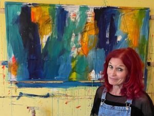
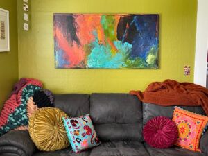
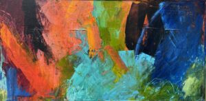
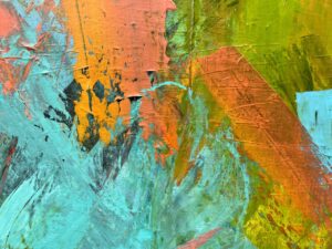
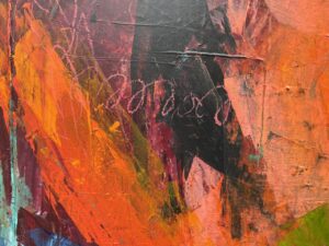
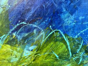
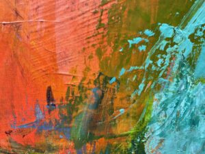
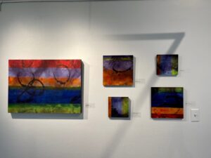
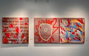
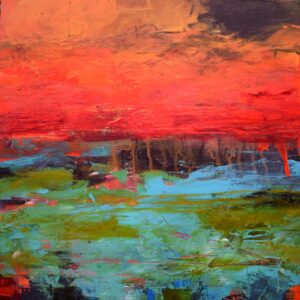
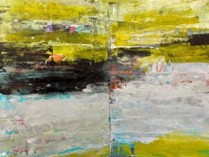
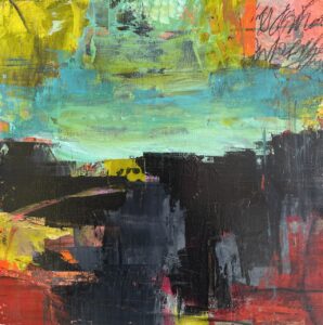
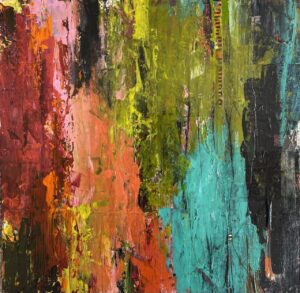
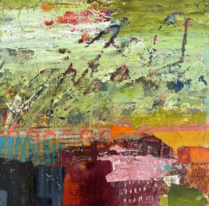
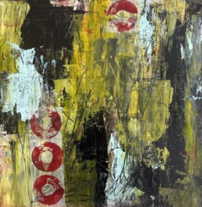
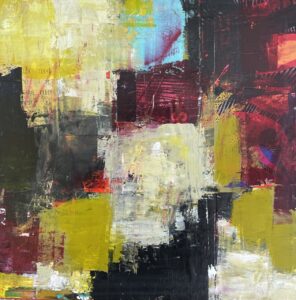
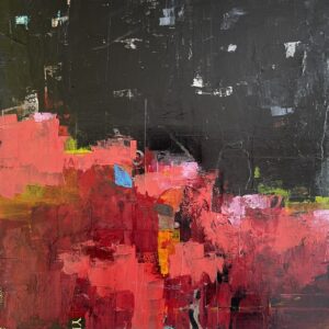
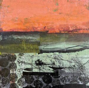
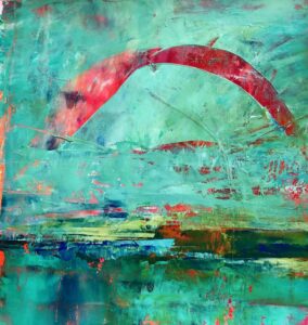
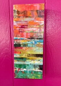
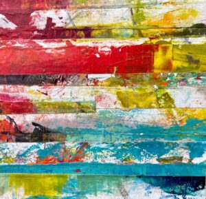
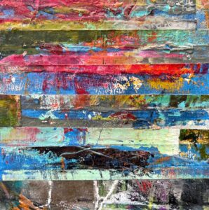
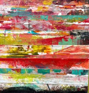
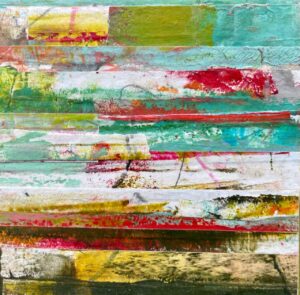
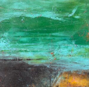
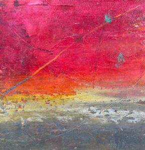
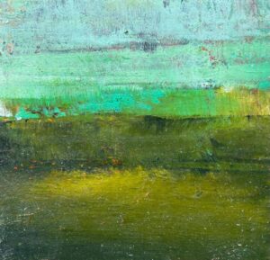
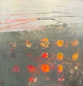
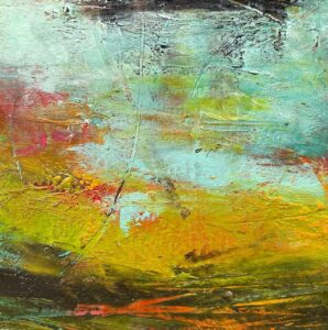
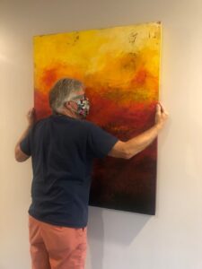
It was finally what I had wanted all along (but didn’t know what that was until it appeared). Here is the final painting and some close ups of different areas.
“A Courageous Act of Flamboyance,” 25-1/2 x 49-1/2 inches, acrylic on canvas, sealed with cold wax, and a painted frame, by Dayna Collins.
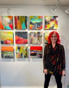
But guess what? I needed a big painting for Fogue Gallery in Seattle, so this finally finished pop of color piece of art will be heading north on Thursday and be on display and for sale just in time for the Georgetown Art Attack on Saturday, April 7.
And the wall above our couch is once again empty and in need of art.
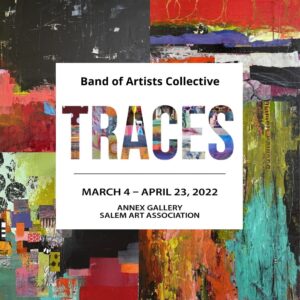
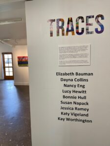
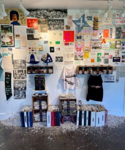
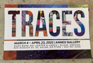
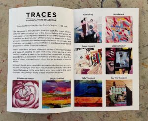
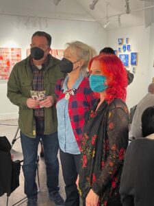
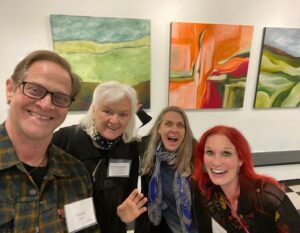
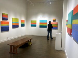
Finally, our long overdue and postponed group show, Traces, is now on view at the Salem Art Association Annex Gallery. During the two-year wait for things to reopen and get our show rescheduled, we changed our name from the Salem Art group to the Band of Artists Collective, but we’re the same group of talented artists. We’ve been plotting and planning for this show over the past few months, and got together in February to make final preparations (and take a very serious group photo).
Band of Artists Collective, February, 2022.
The title of our show Traces, could be interpreted however we chose, but our group show statement explains it in more detail:
Like messages to the future and from the past, the traces of nine different paths converge here in the Annex Gallery this spring. As mark makers of varying sorts, these nine artists of the Band of Artists Collective use the indications of their existence as persons in their art work. An interest in superimposing experience, idea, image, and color onto canvas, paper, wood, and fabric is the shared language of any group of artists, this group included.
Artists understand the term palimpsest as way of reusing materials and ideas, of scraping an older work away while leaving a trace behind, a shadow, a nuance of an earlier idea. As women, as artists, as gardeners…as daughters and mothers and friends, we find the trace of others stamped on our minds just as we leave a shadow behind.
Although there is always a narrative somewhere buried in an artwork, it is less necessary to know each individual story than to sense the traces that appear in the work. Bring your own eyes to the work displayed here, perhaps finding a trace of communication.
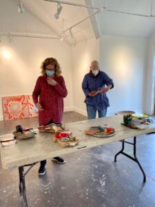
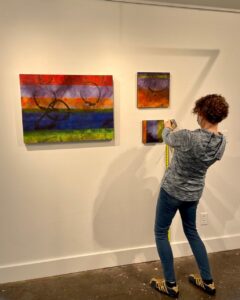
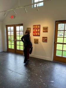
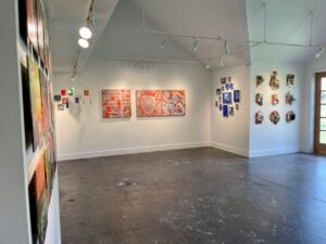
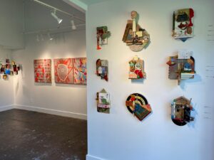
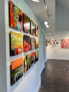
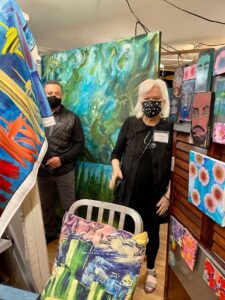
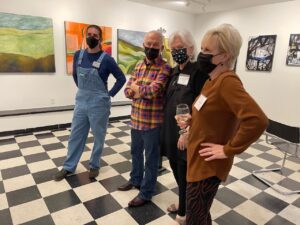
Earlier this week, art work was dropped off. The day I dropped off my work, Kay was dropping off her pieces and Robin was busily hanging Katy’s work, while Kathy was trying to keep track of all of the final details.
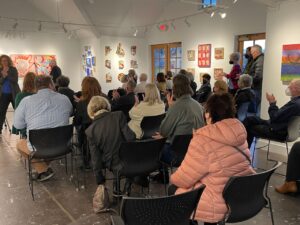
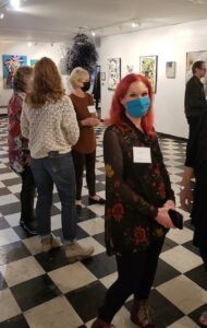
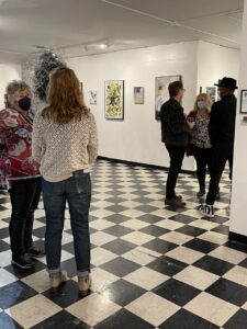
Fast forward to Thursday. I was out for my weekly walk with Joni, and we decided to swing by the Art Annex to see the show. It was so nice to walk into the space and have it to ourselves. It’s a stunning show.
Salem Art Association prepared a beautiful color brochure, which includes a photo of everyone’s work along with individual artist statements.
Here is what I wrote for my Artist Statement – even before I had created my body of work.
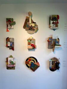
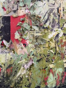
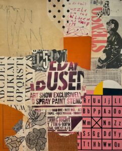
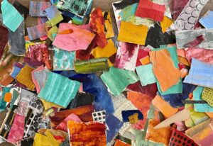
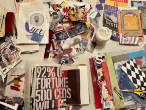
Mixed media is often a wild goose chase down a twisted rabbit hole. It involves a series of what if questions and actions. What if I glued this down, drew a line over the top, added some paint, glued something else down, and then took a sander to it to reveal the first layer of collage, added more paint, then glued something else down, wrote with a wax crayon, then started over?
It is all a grand experimental mystery, which somehow all comes together one way or another. This project fits perfectly with my 2022 word of the year: RISK. I am taking a risk working in a new way, one I have been intrigued with for several years but somehow fear held me back: How can I cover a beautiful collage with paint? And yet covering it, excavating, concealing, and revealing is what I love doing and something I do in paint all the time.
Creating my mixed media pieces is a messy affair, a wild cacophony of cutting, tearing, drawing, gluing, painting, writing, scraping, sanding, layering, revealing, and varnishing. My pieces reflect my curiosity, playfulness, irreverence, and my love of texture, history, and a touch of surprise.
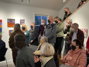
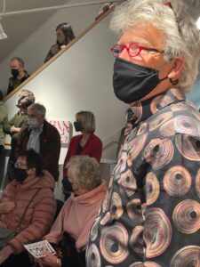
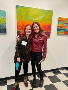
The opening reception was held tonight, it was a marvelous gathering of artists, art lovers, friends, family, and supporters.
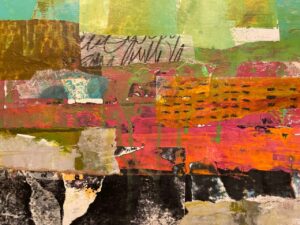
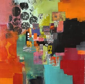
The marriage of paint and collage was much tougher than I imagined. I have been a painter for years, I have been a collagist for even longer, but putting the two together has been a painful labor of love . . . . and finally came together.
I had been moving toward combining paint and collage over the past couple of years, trying to figure out a way of adding paint over collage, and collage over paint, discovering the right balance of revealing and concealing. Adding collage to a board is easy for me, but I never wanted to cover it up with paint. Or I would create a collage, feel brave, add paint, but before I knew it, every bit of the collage was covered up.
My art group, the Band of Artists Collective, has a show opening tonight and I was determined to have my mixed media pieces reflect the successful pairing of collage and paint. I experimented in a small journal, doing quick collages on a series of pages. But I liked the collages and didn’t want to mess them up with paint. Reminding myself that my word for this year is RISK, I spread some paint over a collage. I liked the painting, but the collage was gone. What the hell.
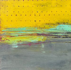
It came time to submit images for our upcoming show. I didn’t have any completed pieces and what if I never found my way to adding paint to collage (or collage to paint). So I submitted photos of two 12×12 inch paintings that were somewhat in the style I hoped to complete, although the work did not have one bit of collage in them.
“An Underwater Dream,” 12×12 inches, acrylic with cold wax, by Dayna Collins.“A Still Pond on a Humid Day,” 12×12 inches, acrylic with cold wax, by Dayna Collins.
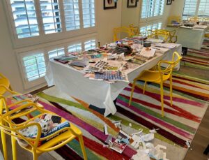
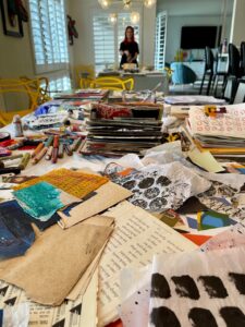
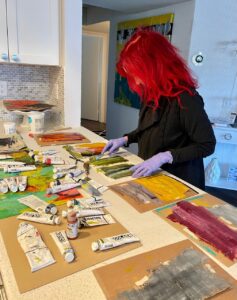
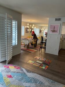
But the challenge was mine, no one else knew I was attempting to pull off this arduous (to me) task. The fear grew, and I became paralyzed. Until I decided to push through. The opportunity came in the form of spending two weeks in Palm Springs in late January. We had rented a modern condo with a large dining room table (that was my main criteria in choosing our rental). I loaded up 12 12×12 inch flat birch panels, three working journals, two big bags of acrylic paint, a gigantic bag of collage materials, and a satchel of art supplies. I claimed the table (and the kitchen bar, and the kitchen prep counter, and sometimes the floor) as my work space. We were in Palm Springs to celebrate Howard’s birthday and his retirement, so he was there to golf. I was there to paint and collage. It was a beautiful win/win situation.
Daily, I worked in my journals.
I glued down collage onto the 12 boards.
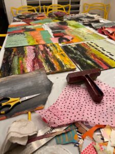
Then I sidetracked myself to create a fresh batch of painted collage papers (that process is worthy of an entire blog post!).
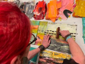
And then I did what I had been hesitant to do. I started combining paint and collage in any way I could think to do it. If I did too much painting, I just added more collage. Sometimes I painted too much on purpose and glued collage on top. Sometimes I painted over the collage, revealing tiny bits of the collage beneath the surface. I sanded, I scraped, I reapplied paint, and added more collage.
I started to find my rhythm and I was having fun.
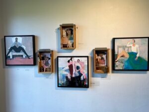
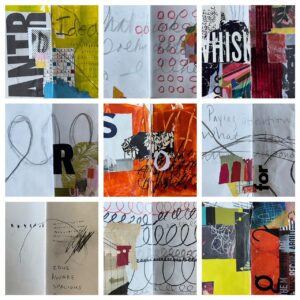
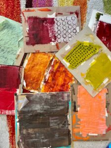
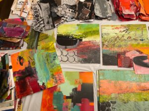
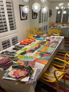
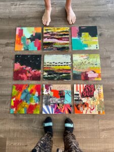
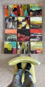
A body of work came together. I had started with the idea of creating six pieces for the show, and then it grew to nine. At the end of our two weeks in Palm Springs, I had twelve boards with potential. After we got home, I fine tuned a few of the panels and I had 12 that were show worthy – a beautiful grid.
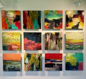
Here are the 12 that are in the show.
“When Possibilities Seem Endless,” 12×12 inches, acrylic and collage on flat birch board, mounted on a block, by Dayna Collins.“This Big Life,” 12×12 inches, acrylic and collage on flat birch board, mounted on a block, by Dayna Collins.“Secret Confessions,” 12×12 inches, acrylic and collage on flat birch board, mounted on a block, by Dayna Collins.“Robust Vulnerability,” 12×12 inches, acrylic and collage on flat birch board, mounted on a block, by Dayna Collins.“Nervous Curiosity,” 12×12 inches, acrylic and collage on flat birch board, mounted on a block, by Dayna Collins.“Luminous Vulnerability,” 12×12 inches, acrylic and collage on flat birch board, mounted on a block, by Dayna Collins.“In the Presence of Mystery,” 12×12 inches, acrylic and collage on flat birch board, mounted on a block, by Dayna Collins.“Dance of Distraction,” 12×12 inches, acrylic and collage on flat birch board, mounted on a block, by Dayna Collins.“Blurred Boundaries,” 12×12 inches, acrylic and collage on flat birch board, mounted on a block, by Dayna Collins.“A Lending Library of Wonders,” 12×12 inches, acrylic and collage on flat birch board, mounted on a block, by Dayna Collins.“A Deeper Sense of Belonging,” 12×12 inches, acrylic and collage on flat birch board, mounted on a block, by Dayna Collins.“A Chorus of Memory,” 12×12 inches, acrylic and collage on flat birch board, mounted on a block, by Dayna Collins.
Traces opens tonight . . . . next up, my blog about the show.
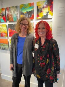
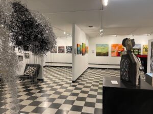
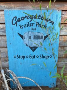
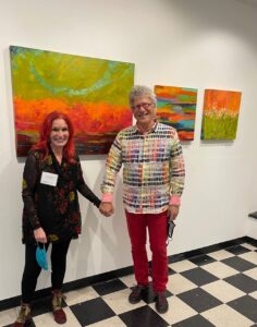
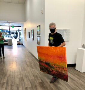
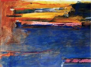
I’m delighted to share the news that my art is in a new gallery (and in a new state). I was invited by the owner of Fogue Gallery, Kerry Gates, to display my art at this lovely Georgetown gallery, located about four miles south of downtown Seattle. Georgetown is a lively and funky neighborhood, with several art galleries, numerous restaurants, eclectic shops, and the Georgetown Trailer Mall.
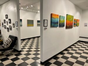
Last month, Howard and I made the drive north to the gallery to hang my art on a beautiful, freshly painted white wall, where we hung five of my oil and cold wax paintings.
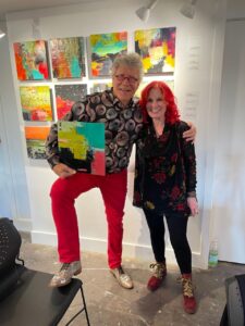
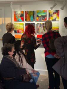
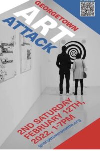
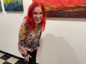
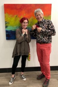
The second Saturday of every month is Georgetown’s Art Attack, so we got a room at the Georgetown Inn and attended our first art walk. What a blast!
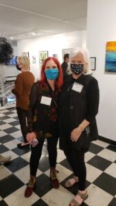
I got to see my friend Kathleen, who has been a longtime artist at the gallery, and she was gracious enough to introduce me to several of the other artists showing their work in the gallery.
Our oldest daughter lives in Tacoma and she drove up to show her support and cheer me on.
What an evening.
A tiny peek at Georgetown in case you’ve never been . . .
And my biggest thanks goes to my husband, Howard, who does ALL of the behind the scenes work like wiring, inventory, cataloging, schlepping, hanging, adjusting lights, and color coordinating his clothes to match my art.
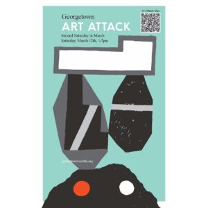
The next Georgetown Art Attack is Saturday, March 12. I’ll be there, so stop by and say hello.
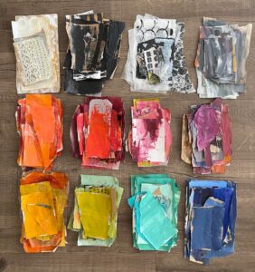
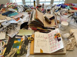
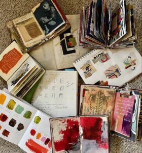
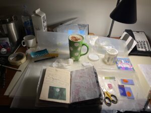
I have too many flippin’ journals all going at once, so what am I thinking starting another one. I am a sucker for journals. At the current time I am actively working in several. Follow me . . . .
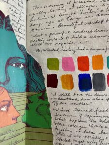
Color Journal: A place to keep track of colors I like, the brands of colors because not all colors are the same, what happens when certain colors are mixed together, formulas of colors I like, and the Pantone color of the year (this year it is Very Peri).
A small painting journal where I have combined paintings with art quotes on the opposite page. This has been in process for the past couple of years.
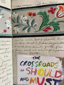
A vintage book where I wipe off excess paint from my palette, clean off my brushes on the pages, glue in leftover tidbits, and experiment with quick ideas that pop into my head.
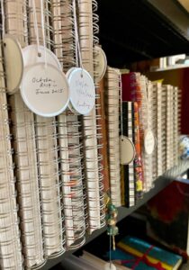
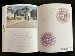
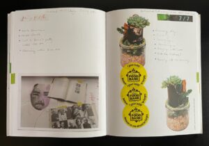
Visual Journal: This 9×12 inch journal is my hard-working jack of all trades journal. I take notes in it when I take a class, record ideas for a painting or a show, sketch out ideas, and take notes at art meetings. This is my official visual journal and has been a key part of my art practice for many years. The journals are lined up in my studio with little tags indicating the dates covered in each journal.
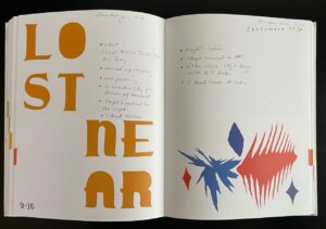
Collage Journal: An old composition book where a student kept notes and did engineering types of drawing, and also glued in tests and notes. I use this journal to create collage compositions right over the writing and drawings. The glued in papers I have torn out, but gluey residue peeks through on many of the pages.
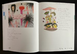
Junk Journal: I created this big chunky book out of hundreds of pieces of old papers, collage materials, and ephemera, and created three signatures (or was it four? the journal is thick). The junk part was my use of junky papers, but then I have gone back in and embellished the pages, fleshing out more complete collage compositions. I have been working on this one for months!
Covid Journal: When Covid hit in full force in early 2020, I took one of the junk journals I had made and recorded milestones and statistics for the first full year of our lockdown. Every once in a while I will go back in make a note or update the statistics. Sadly, I am entering the third year of entries.
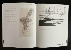
Travel Journal: Anytime we take a biggish trip, I maintain a travel journal. My most recent travel journal was done in September when we spent a couple of weeks in New York. I used a handmade artist journal and cut and glued paper and ephemera from our daily excursions.
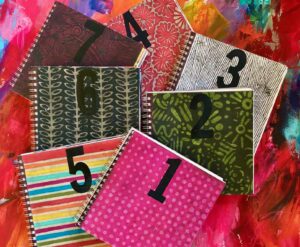
Which brings me to January, 2022, and the decision to what I plan to do regarding a journal in the new year. In 2019 I committed to painting a painting a day in a 9×9 inch journal and somehow I pulled it off. Sometimes I was playing catch up, but for the most part keeping that painting journal got me into my studio. Every. Single.Day. (And it took seven journals to get through the year.)
A few of my favorite paintings from my 2019 journals:
Day 35Day 224Day 294Day 239
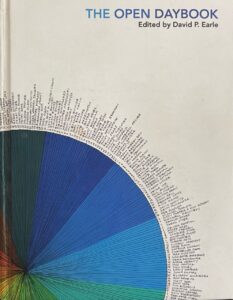
In deciding what kind of journal would be most enjoyable, I flashed back to 2012 when I used “The Open Daybook,” a perpetual calendar book, edited by David P. Earle. I remember buying this big book of a journal at Monograph Bookwerks (fine art books, objects, + ephemera), located in NE Portland, and I was so excited to use it to record what I did every day for a year. Each page has original art by 365 artists (actually 371 as some worked in groups), so the imagery and graphics were always a treat.
A few of my pages from 2012. My entries were short and sweet, but really captured in detail how I spent my days.
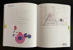
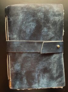
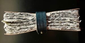
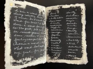
That year of record keeping got me to thinking about what kind of journal I would keep now, ten years later. I keep a lot of visual journals (obviously, from the list above), and I have a calendar on my desk. But what if I kept my own sort of Daybook, a cross between what I did today, but coupled with a sprinkling of collage, dabs of paint, imagery, ideas, quotes, and what is on my mind (now there’s a scary thought). I liked the sound of this combination and I just happened to have the right journal for the job (cue the dramatic music), a chunky beast of a journal, built by Leather Village craftspeople.
I wrote a private preamble on New Year’s Eve, then jumped in on January 1st.
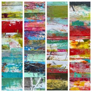
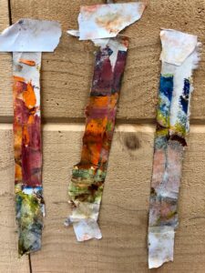
In my last post, Little Paintings, I shared how I painted small oil and cold wax paintings on Arches Oil Paper by taping small squares of the paper to a large piece of newsprint or butcher paper. I briefly mentioned how I remove the tape . . . . this post is what I do with the tape that I removed.
Removing tape from Arches Oil Paper.
Over the past couple of years, I have saved and collected all of the pieces of tape I have removed from the little taped down paintings. (Do you think I’m a bit compulsive? Or obsessive?)
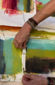
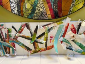
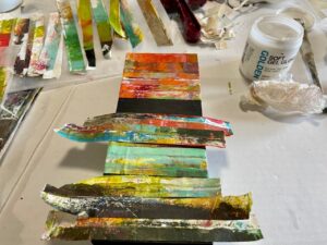
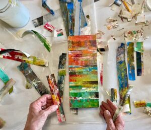
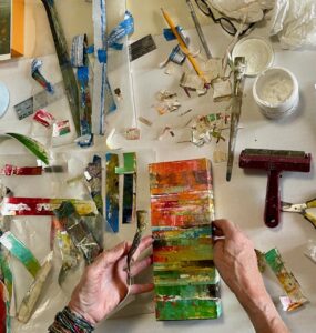
I am always amazed by the beautiful little abstract paintings on the pieces of tape, sometimes even wishing I could paint a larger painting using the pieces of tape as inspiration. . . . and then inspiration struck. What if I used the strips of tape to create an abstract painting? I like stripes, I like color, I like abstract, and I like recycling and reuse. I started auditioning the strips of tape. Before too long, I had a pleasing arrangement and composition and I started gluing down the strips.
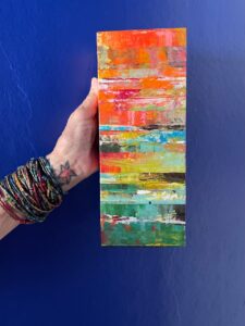
For my first piece, I mounted the tape pieces onto a 4×10 inch cradled panel.
And hung it in our brightly colored kitchen at the House of Color in Astoria.
By then I was smitten so I forged ahead and taped down strips of color onto four 6×6-inch cradled panels.
“Profound Harmony,” 6×6 inches, oil and cold wax on white painter’s tape, mounted to cradled wood panel, by Dayna Collins.“Deep Knowledge,” 6×6 inches, oil and cold wax on blue painter’s tape, mounted on cradled wood panel, by Dayna Collins.“Changing Emotions” 6×6 inches, oil and cold wax on white painters tape, mounted on cradled wood panel, by Dayna Collins.“Small Curiosities,” 6×6 inches, oil and cold wax on white painter’s tape, mounted on cradled wood panel, by Dayna Collins.
These four pieces have been added to my online shop and are $100 each (which includes shipping in the US).
It’s that time of year when galleries like to offer smaller pieces of art at a price point that people can purchase original art as gifts — I have always loved this idea, whether for gifts, or for personal collections. I am excited to be sending small pieces of art to my three galleries: Guardino Gallery(in Portland), Salem on the Edge (in Salem), and RiverSea Gallery (in Astoria). I thought that rather than just sharing photos of the art that I have created for these three galleries, I would first share a bit of the background in creating these pieces.
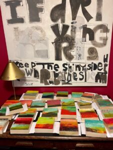
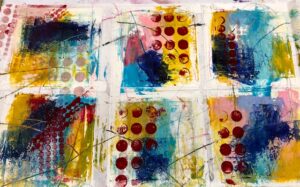
When I teach my Oil and Cold Wax Abstracted Landscapes class at Sitka Center for Art and Ecology, we do warm ups throughout the week using Arches Oil Paper, which we tape (using painter’s tape) onto large sheets of butcher paper or newsprint. I give verbal prompts for things to do on these small squares of oil paper and while giving these prompts, I also follow along and do the prompts on my own squares of paper. By the end of the class, we all have several completed paintings as well as several fun starts for finishing in the future. Here are some examples of the taped down pieces of paper at various stages.
This year, I took several of the sheets of taped down paper pieces, and started tackling the small squares one at a time, adding layers, marks, creating compositions, and resolving issues, working on them while they were still taped down with six paintings per sheet of paper.
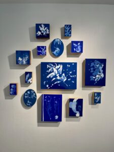
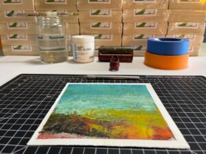
Once I resolved the paintings, I removed the tape (WATCH FOR MY NEXT BLOG POST WHERE I SHARE WHAT I DID WITH THE PEELED UP TAPE!), trimmed the edges of the paper where the tape had been, and then glued the painting onto a cradled wood panel. I applied a final layer of cold wax and varnished the edges. By the time I had completed this process, I had 26 paintings, six were 5×5 inches, and the rest were 6×6 inches.
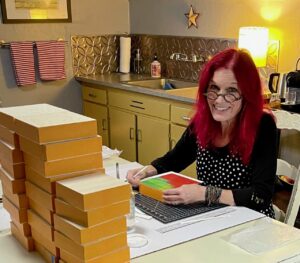
Fast forward to today. All of the pieces have been waxed, buffed, varnished, wired, titled, photographed, inventoried, and boxed. Deliveries will begin happening over the next couple of weeks. Whew. Here are some of the completed pieces heading to my three galleries.
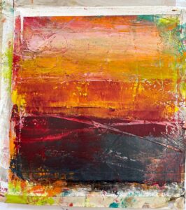
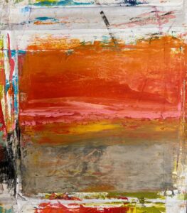
“The Blur of Memories,” 6×6 inches, oil and cold wax, on cradled panel, by Dayna Collins.“Smoldering Silence,” 6×6 inches, oil and cold wax, on cradled panel, by Dayna Collins.“Reflecting Sunlight,” 6×6 inches, oil and cold wax, on cradled panel, by Dayna Collins.“Out of the Silence,” 6×6 inches, oil and cold wax, on cradled panel, by Dayna Collins.“Happy Silence of Mind,” 6×6 inches, oil and cold wax, on cradled panel, by Dayna Collins.“In the Silence of the Evening,” 6×6 inches, oil and cold wax, on cradled panel, by Dayna Collins.“Fearless Love,” 6×6 inches, oil and cold wax, on cradled panel, by Dayna Collins.“Coastal Riptides,” 6×6 inches, oil and cold wax, on cradled panel, by Dayna Collins.“A New State of Wonder,” 6×6 inches, oil and cold wax, on cradled panel, by Dayna Collins.“Untethered in Space,” 6×6 inches, oil and cold wax, on cradled panel, by Dayna Collins.“Along the Tideline,” 6×6 inches, oil and cold wax, on cradled panel, by Dayna Collins.“Stirrings of Enchantment,” 6×6 inches, oil and cold wax, on cradled panel, by Dayna Collins.
In addition to the 21 pieces headed to the galleries, priced at $100 each, I have five of the 5×5 inch pieces available on my website. The 5×5 inch pieces are $70 (and include shipping).
“Currents of Cool Wind,” 5×5 inches, oil and cold wax, on cradled panel, by Dayna Collins.“A Place of Peace,” 5×5 inches, oil and cold wax, on cradled panel, by Dayna Collins.“A Field of Peace,” 5×5 inches, oil and cold wax, on cradled panel, by Dayna Collins.“A Thin Fog of Moonlight,” 5×5 inches, oil and cold wax, on cradled panel, by Dayna Collins.“Fistfuls of Sky,” 5×5 inches, oil and cold wax, on cradled panel, by Dayna Collins
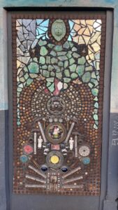
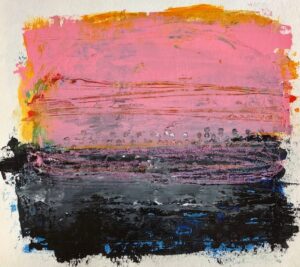
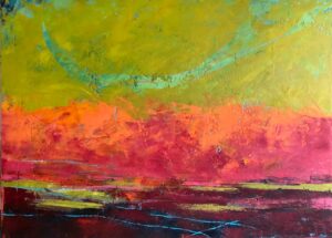
NOTE: The beautiful graphic painting at the beginning of this post, was created by Salem artist, Sloy Nichols.
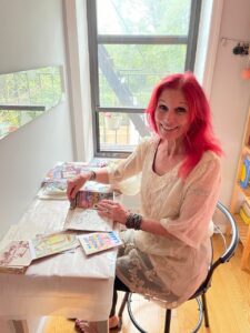
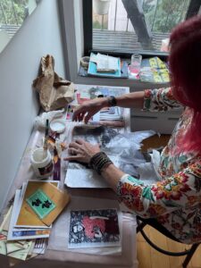
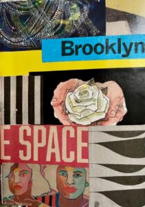
We spent the last two weeks of September in Brooklyn, New York, so of course I logged our trip with a Salvage Collage junk journal.
I didn’t make my own journal, but used one created by my friend Laurie at Black Dog Studio. It came with a nice variety of papers, including some heavy watercolor paper, so I was able to adhere all kinds of papers, post cards, street fliers, and whatever paper materials I could scrounge. It was a bit more challenging on this trip because during a pandemic, there isn’t as much print material as usual. But being the scrounger and junker that I am, I managed to cobble together a pretty interesting journal.
We rented a tiny Airbnb apartment in the Sunset Park neighborhood of Brooklyn. I set up my make do studio on a tiny desk in the corner of the tiny bedroom with a nice view of the fire escape and the Manhattan skyline in the distance.
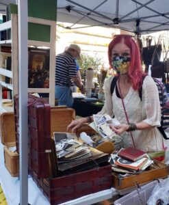
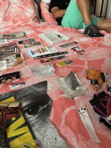
I hunted and gathered each day, my piles of possible fodder growing and expanding, and I used the bed as a place to sort.
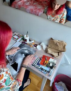
Every night after a day of exploring Brooklyn (or Manhattan), I returned to our apartment, where I cut and pasted the scraps I gathered during the day, into my journal. The journal began to take on a life of its own. I didn’t keep a chronological travelogue, or even write about our days. I just ripped, cut, and glued, creating a collaged journal with visual reminders of our first big trip in three years.
On our return trip, we turned a two hour layover in San Francisco into a three day layover (so I could see the Joan Mitchell exhibitat the San Francisco Museum of Modern Art). My travel journal just kept growing, setting up my studio on the desk in the corner of our hotel room.
I am pleased to offer an article written by guest Howard Collins. Howard is my spouse of 49 years and for the past year, the business manager for my art practice. Howard is my number one fan and his taste in art has evolved through the years, which prompted him to write this article for my blog.
Howard is an active participant in Dayna’s art practice, doing everything from administrative to schlepping.
“Ugh.” “I don’t get it.” “That’s weird.” “What’s the point?”
These words have admittedly come from me about abstract art.
My gradual transformation into appreciating and loving abstract works has taken time. Unlike the acquired taste for kombucha, which took real effort and perseverance, coming to love abstract art was more evolutionary than effort.
Howard checking out Dayna’s January, 2021 show, “Emotional Alignments” at RiverSea Gallery in Astoria, Oregon.
My early years of art appreciation was not as a result of education. It was more akin to “Me like, pretty,” when I saw something that caught my eye. But art has always been important to me regardless of my ignorance. My eye was attracted to precision, to realism, to clarity, and realistic portraits. In walking through museums, I was attracted to and spent as much time as I could looking at the details by various master artists. I always gave a short glance at modern, contemporary, and abstract art, but never much time and clearly little thought.
However, I subtly found myself spending more time looking at impressionist art and less realistic works. Monet blew me away. Here was realism without precision and detail, but beautiful nonetheless. This was a style of art without precision, but collectively, the strokes created beautiful compositions. My eyes began to look at the art of other impressionists and marvel at their beauty. Without warning I began to spend even more time looking at non representational art. My world of art appreciation exploded.
“Turns of the Kaleidoscope,” 30×40 inches, plaster, oil, and cold wax. One of Howard’s favorite pieces.
Dayna’s taste in art has always differed from mine. I began to look closer at pieces and artists to whom she was attracted. It stretched me to look at works that I previously would only glance at and rarely see. Vertical and horizontal colorful lines, unusual compositions, and figures in ways that had usually left me cold, now drew me in.
Howard spending time with six 12×12 pieces in Dayna’s “Turns of the Kaleidoscope” show at Salem on the Edge, May, 2021.
Modern art, cubism, angles, distorted figures all called me to view them in a way I had not felt before. I found Pollock, Kandinski and de Kooning, and a renewed interest in Picasso.
And therein lies the difference for me. I felt the art. An emotional response rather than mere appreciation of the art. Feeling what the piece was sharing with me, allowing the piece to talk to me. This was a moving experience and was totally unlike viewing realistic works. As strange as it sounds, listening as a piece talks to you is quite normal. Explaining how this works for me is difficult, but it is real. For me works of art talk to me through their composition, arrangement, color and form, which cause an emotional response in me.
My eye views abstract art and its perceived disorganization in different ways. At times I seek to make sense of the abstract lines, shadows and colors by seeing what I can see. At times I take in the whole of the abstract and free myself from my realism tendency; and then at other times, I pick a small portion to see what I can see and hear from the art. If I bring an attitude of openness, it allows the painting to express itself and for my eyes, brain, and emotions to react.
One of Howard’s favorites: “It Smelled Like the End of Summer,” 30×40 inches, plaster, oil, and cold wax, now hanging at The Independence Hotel.
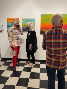
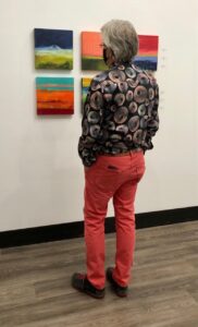
I have to interject a side story here. We recently talked to the maintenance engineer at The Dundee Hotel. I told him Dayna was the artist of many of the works hanging there and his eyes lit up. “Did you do the pieces in the conference room?” he asked Dayna. “Yes,” was her reply and he said: “I have questions for you. I’ve studied them.” We walked to the three painting and he wanted to know if the images he saw in them were intentional. He saw birds, a cow, and other animals throughout her works. Dayna laughed and said “Don’t show me, I’ll never be able to not see them.”
Jim points out what he sees in three of Dayna’s abstract paintings, now hanging in the Board Room of the Dundee Hotel.
He was astounded to hear that Dayna had not intentionally included farm animals in her abstracts. He was trying to make sense of the abstract work though his interpretation of what he saw. By the way, he loved the works and his appreciation came from their composition and his interpretation, and not by the intention of the artist.
In my wasted youth, I thought Picasso was odd, irrelevant, and not really worth looking at. Even today not all of his pieces move me, but many do in a way I would never have thought possible. His humor is outstanding. I stood before a Picasso series created during the last months of WWII and I was laughing. They were optimistic, playful, joyful and irreverent. Yes, I was the only one laughing, but that’s me. They were simply magnificent.
Then there is the power of abstract. There is power in the stroke, texture, form, composition, and message. With or without a representational image, abstract work speaks and conveys a message. In part, the power comes from eliminating a common scene or picture for our minds to see. We are engaged to interact with the artists’ work. Just as letting our children play in a dusty pile of dirt, they create games, form roads, and valleys in their minds, which they translate into the dirt pile; just as we get to create from abstract art.
One of Howard’s favorites: “Fleeting Amazement,” 24×36 inches, acrylic on canvas, hanging at The Dundee Hotel.
Amazingly, the power of abstract art endures beyond a single viewing but continues over time and changes as we see different elements as we change. A piece of Dayna’s work, Singed by Fire and Light, hung in my office for three years until I moved my office home. Every day this piece spoke to me, every day it gave me something. Sometimes it spoke to me as a whole, drawing me deep inside; sometimes from a small section, sometimes from hints of color revealed from the sunlight pouring in the window. I miss this piece terribly. It now hangs beautifully at The Dundee Hotel, where I am writing this piece and I’ve literally hugged it.
Howard hugs “Singed by Fire and Light,” now hanging in The Dundee Hotel.
I still appreciate and enjoy realism and impressionism. But abstract art, with a big thank you to my wife, attracts me, speaks to me and fills me.
Artists Dayna admires:
Joan Mitchell, Helen Frankenthaler, Lee Krasner, Elaine deKooning, Cy Twombly, Robert Motherwell, Robert Diebenkorn
One of Dayna’s favorite artists: Helen Frankenthaler
Artists I admire:
Mark Rothko, Willem deKooning , Jackson Pollock, Picasso, Kandinski, Dayna Collins
Dayna and Howard at the opening of Dayna’s show at Salem on the Edge in May, 2021, “Turns of the Kaleidoscope.”
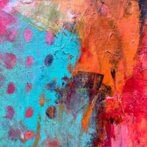
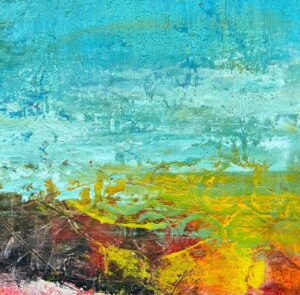
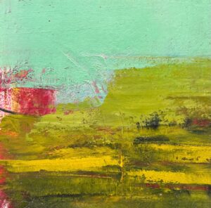
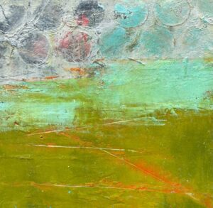
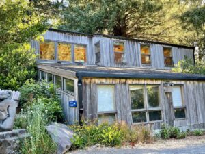
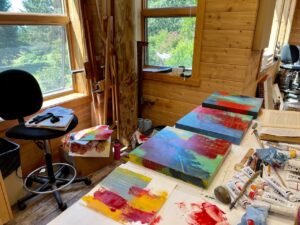
Last week I was finally back at Sitka in the beautiful Boyden studio, not teaching, but taking a class from Eugene artist Zoe Cohen. The class was titled Abstract Investigations: Color and Composition. What a great class in my one of my favorite locations — on the Oregon coast at Cascade Head.
Zoe’s description of the class:
This four-day workshop is designed specifically for abstract painters to help clarify visual language and bring intentionality to their painting practice. We will make a deep inquiry into what inspires our art through examining contemporary abstract art, informal writing exercises and instructor demos. We will traverse the full range of the spectrum from intuition to deliberate action, from right brain to left brain and from spontaneity to decision, and we will learn to travel back and forth between these polarities.
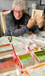
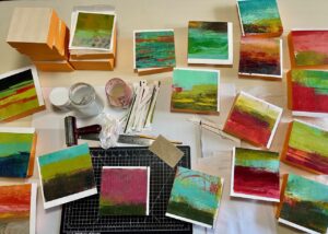
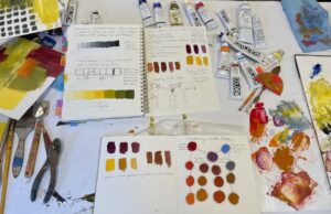
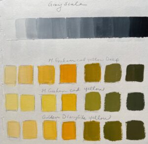
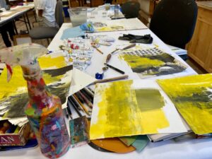
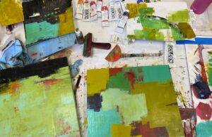
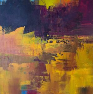
The class had all the elements that are important and that I love. The first day we focused on value and color mixing, always a good place to start.
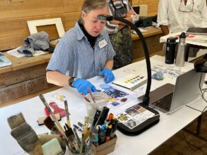
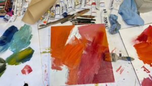
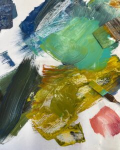
The second day we focused on tools and techniques, and we were all off to the races after a couple of demos by Zoe. The day for me was dedicated to initial layers and playing around with leftover paint.
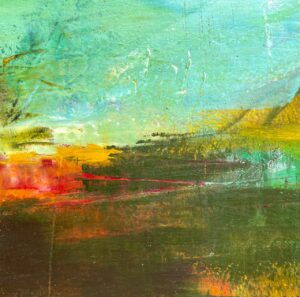
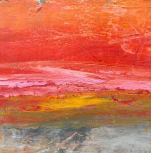
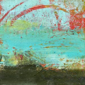
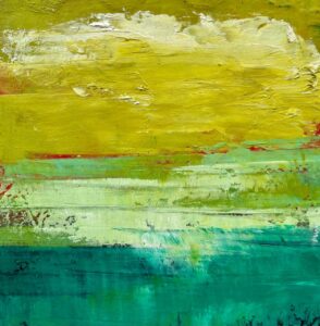
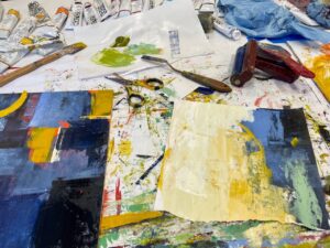
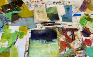
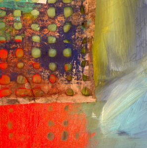
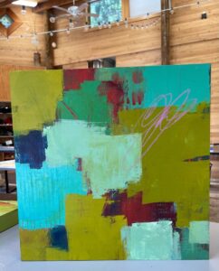
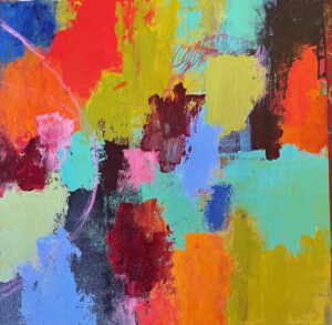
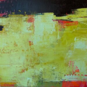
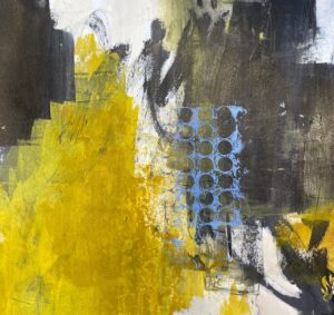
Day 3 was more layers and exploration of abstraction, intuitive versus deliberate actions. We began to look for the composition in our paintings and move our pieces forward. I worked on 10×10-inch pieces of Stonehenge printmaking paper, 12×12-inch wood panels, and 14×14-inch cradled birch panels. I liked jumping between these three substrates.
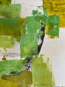
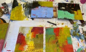
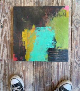
On the final day, we primarily focused on painting and completing a few pieces. It was a whirlwind of a day, especially since we had to stop a little early to pack up and have a show and tell before class concluded.
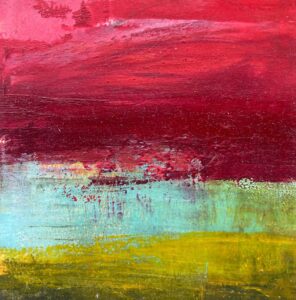
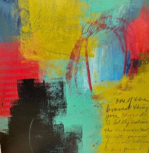
These are the pieces that I moved forward to various stages of completion; a few of them I have declared finished and the others, I’ve just stopped at interesting places.
Post script . . . . .
Each morning before heading to class, I read a section from jung pueblo’s Clarity and Connection.When I read something that resonated with me, I jotted the words down in my visual journal–the journal I took to class and where I took notes. On our final day, this was the passage I wrote in my journal:
 And then I began applying paint.